What makes a small-business website convert visitors into inquiries?
A conversion-focused website is not about pressure. It is about clarity, trust, proof, and a path that makes the next step easy.
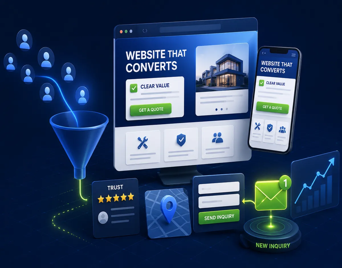
A small-business website converts when the right visitor quickly understands three things: this business solves my problem, I can trust them, and the next step is simple.
That sounds obvious, but many websites fail at one of those points. They look modern but say very little. They list services but do not explain who they are for. They have a contact form but no reason to use it. They show personality but no proof. They publish pages for search but forget the human being who has to make a decision.
Conversion is not about tricks. It is about reducing uncertainty.
For a service business, every page should help a serious buyer move from vague interest to confident inquiry. That requires content, design, performance, structure, and technical execution working together.
Start with a specific promise
The homepage should not make visitors decode the business. A strong first screen usually answers who you help, what you help them do, and why the result matters.
"We build digital experiences" is too abstract. "Custom websites and booking tools for clinics that need more qualified appointment requests" is clearer. "E-commerce development for small brands that need a faster store and easier product management" gives the visitor something to evaluate.
Specificity does not reduce opportunity as much as business owners fear. It helps the right people recognize themselves. Akrivon can build many kinds of websites and apps, but each page should still speak to a concrete problem. General capability belongs in supporting content. The first promise should be sharp enough to make a buyer keep reading.
If you are unsure whether your project needs public pages or deeper software behavior, read website vs web app before scoping the build.
Give every service its own page
Small businesses often put everything on one services page because it feels efficient. It is rarely efficient for search or sales.
A visitor looking for ecommerce development has different questions than a visitor looking for a website redesign, technical SEO implementation, client portal, or mobile app. One page cannot answer all of those questions deeply without becoming generic.
Service pages let each offer match a specific search intent. They also let you explain the problem, the process, the deliverables, price factors, timeline, proof, and next step in language that fits that buyer. This is not only good SEO. It is good sales support.
The same principle applies to industries. A clinic website, law firm site, consultant site, restaurant site, and government service page may all use similar technology, but the decision criteria are different. Good content respects those differences.
Show proof near the decision
Proof should appear before the visitor has to ask for it. Case studies, screenshots, client comments, metrics, before-and-after examples, process details, and named constraints all help.
The most persuasive proof is specific. "We create high-quality websites" is a claim. "We rebuilt a slow service website, clarified the offer, reduced page weight, and made the contact path easier on mobile" is evidence of thinking. Even when client names cannot be published, you can describe industry, problem, approach, and outcome without exposing private details.
Proof should also match the page. A visitor reading about technical SEO wants implementation competence. A startup founder wants product judgment. A government contractor wants standards discipline. A small retailer wants ecommerce reliability. Do not make everyone dig through the same portfolio grid to infer relevance.
For deeper rebuild planning, the website redesign checklist explains how to audit what proof and pages already work.
Make pricing less mysterious
Many small-business websites hide pricing completely because the owner worries competitors will see it or buyers will be scared away. The result is often worse: visitors assume the service is either too expensive, too cheap, or too unclear to bother asking.
You do not need to publish an exact price for every project. You can explain ranges, starting points, what affects cost, and what is usually included. This filters poor-fit leads and helps serious buyers approach the conversation with realistic expectations.
Pricing content also builds trust because it shows the business understands project planning. A buyer with a budget wants to know whether they are in the right room. A vague "contact us for a quote" gives them no signal.
The existing guide on website development cost in 2026 is useful internal reading for visitors who need budget context before contacting Akrivon.
Reduce form friction
The contact form should qualify the inquiry without becoming a barrier. Ask for the information needed to start a useful conversation: name, email, project type, goal, approximate budget if relevant, deadline, and a short message. Avoid forcing a long specification before trust exists.
Mobile matters here. Many serious buyers will check your site on a phone, save it, and return later. The form should be easy to tap, labels should be clear, validation should be helpful, and the confirmation should make it obvious that the submission worked.
Give cautious visitors a softer path too. Some people are not ready to send a message but will read pricing, process, articles, or case studies. Internal links can keep them moving until they are ready.
That is why interlinking matters. A page about ecommerce can link to pricing. A post about mobile apps can link to MVP timelines. A technical SEO article can link to performance. The site becomes a guided conversation instead of isolated pages.
Do not ignore speed and stability
A slow website makes every message weaker. Visitors may not consciously blame performance, but they feel the delay. They hesitate, bounce, or compare you unfavorably with a faster competitor.
Conversion-focused design includes performance decisions: optimized images, stable layout, readable typography, restrained scripts, fast hosting, clean code, and simple interaction patterns. This is especially important for small businesses because they cannot always compensate with huge traffic volume. Every qualified visit matters.
The Core Web Vitals article explains why loading, responsiveness, and layout stability affect leads. For a business owner, the key point is simple: the site should feel competent before the visitor reads a word of your process.
Match the next step to buyer readiness
Not every visitor is ready for the same call to action. A founder with a clear MVP idea may want to book a discovery call. A small business owner may want to understand cost first. An SEO agency may want to ask about implementation capacity. A government contractor may need evidence that you can follow a design system.
A converting website gives those visitors different paths without cluttering the page. Primary CTAs can start a project. Secondary links can lead to pricing, process, relevant articles, or work examples.
This does not mean every page needs ten buttons. It means the site should respect the buyer’s stage of decision. If they need confidence, give proof. If they need budget, give pricing context. If they need technical trust, give implementation detail.
Conversion is a system
No single headline, button color, animation, or plugin turns a weak website into a strong one. Conversion comes from the system: clear positioning, useful service pages, proof, pricing context, fast performance, technical SEO, accessible forms, and thoughtful internal links.
The best small-business website feels easy because hard decisions were made before launch. The owner knows who the site is for. The developer builds a structure that supports search and sales. The content answers real questions. The interface lets visitors act without friction.
That is what makes a website more than an online brochure. It becomes a working sales asset.
Have a project in mind?
Get an honest, fixed quote before any work begins.